KINGS OF DISTANCE
KINGS OF DISTANCE

We Take This Kings of Distance Seriously
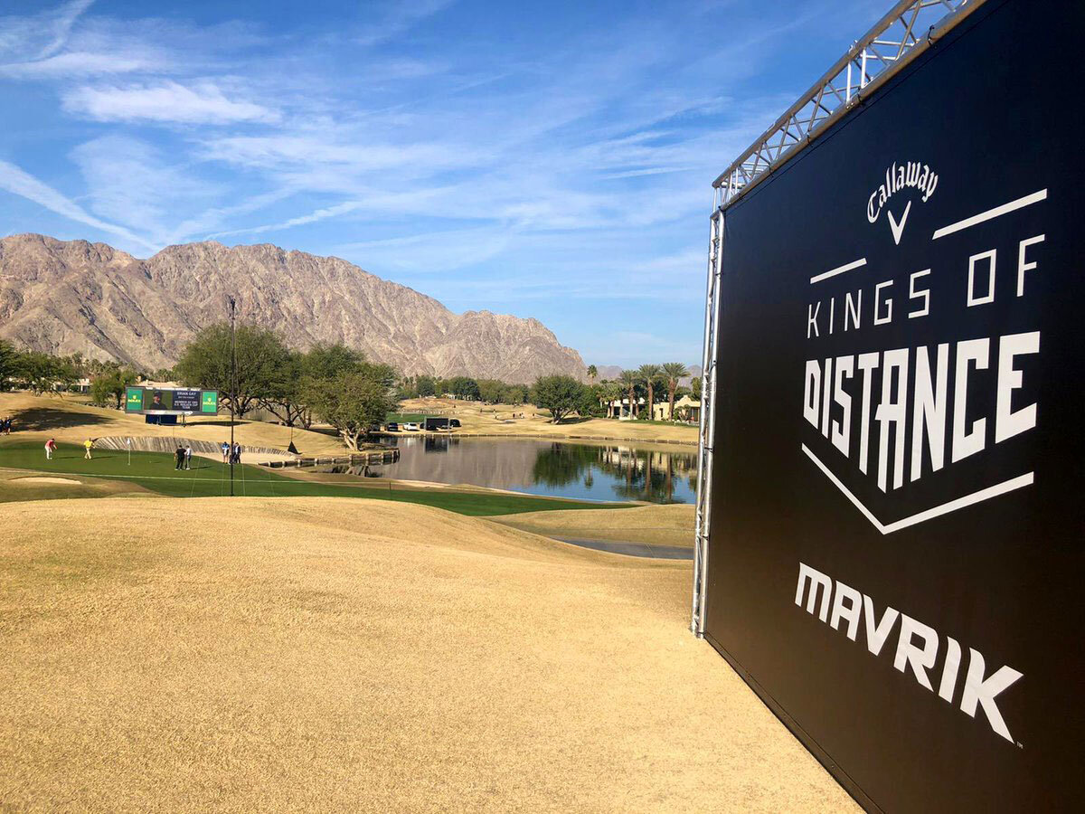
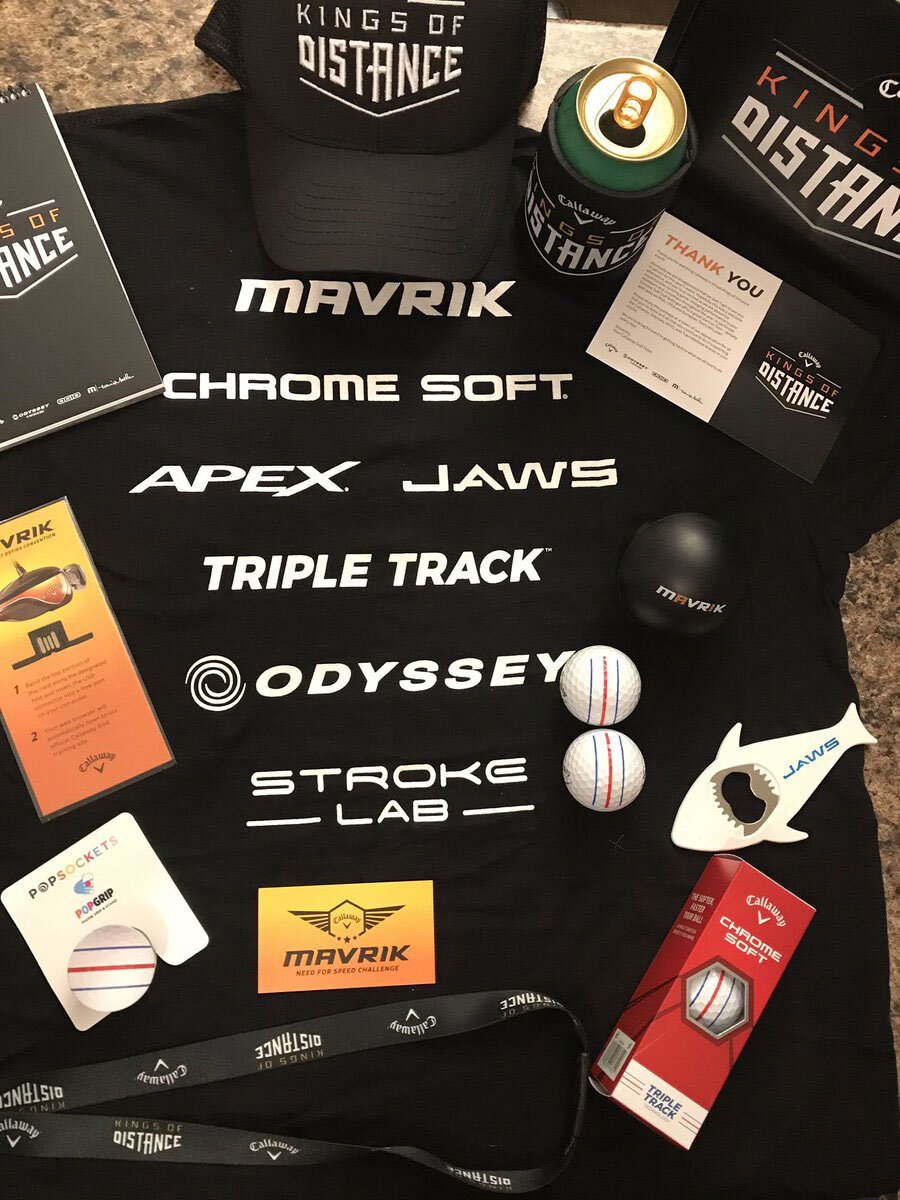
This design was created for Callaway’s Kings of Distance campaign. Every year Callaway’s sales team puts on the Kings of Distance event which promotes their new product offerings for the year. This event takes place at driving ranges across the United States and requires a lot of event collateral such as name tags, hats, beer koozies, t-shirts, etc. We began with a logo redesign and an iconographic styled poster. The icons speak to power, speed and innovation.
Logo Design
Iconography
Event Collateral
Vector Illustration

Logo Design

Old Logo vs. New Logo
The old Kings of Distance logo has been around for over 10 years and needed to be refreshed. It represented the idea of strength and power in a very archaic, obvious way. The combination of font weights, negative space, and sharp angles within the new logo speak to strength, speed, and innovation in an organized, modern way.

Logo In Use

These grass roots public events are the backbone of Callaway’s promotional marketing strategy. They speak directly to the consumer exhibiting a targeted marketing strategy. It is very important that every piece of event collateral provides an experience that is consistent with the overall marketing message.